Skeena Font in Microsoft Office -- what a shitty font

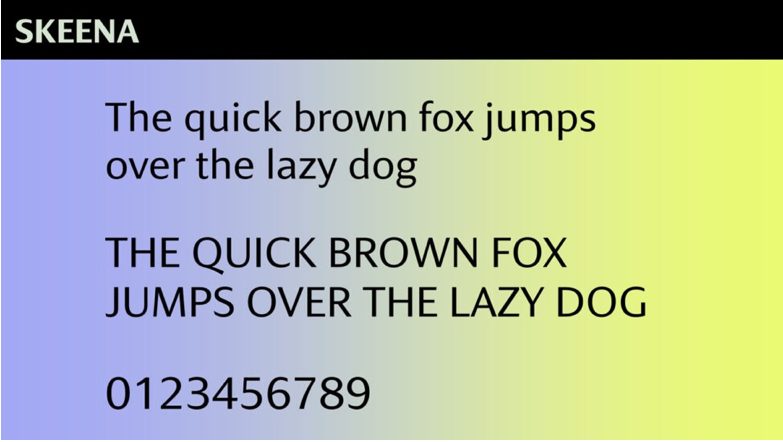
For some reason, Microsoft is updating the default fonts in Microsoft Office, and one of them is named “Skeena.” I guess it was designed by a couple of designers in BC?

Anyway, it’s such a shitty font. Maybe they should have called it the Fraser instead. It’s definitely not as majestic or awe-inspiring as the Skeena River.

Yuck.

1 Like

I’ll stick to Comic Sans… haw haw, when we printed out resumes for people in the days I had a print shop I was tempted to do that for a couple of jerks. Then again, the mill foreman wouldn’t have blinked an eye…

2 Likes

Duig out my 30yr old FontMaker program
image
Fort St. James font

2 Likes